Metawidget supports multiple Layouts for each mobile framework, targeting different arrangements within each environment.
Layout to arrange widgets vertically, using android.widget.LinearLayout. This Layout recognizes the following parameters, configured using LinearLayoutConfig:
| Property | Description |
|---|---|
| labelStyle |
Android style (i.e. @com.myapp:style/label) to apply to labels. The
style should be defined within res/values/styles.xml. For example:
<style name="label"> <item name="android:textSize">10sp</item> </style> |
Layout to arrange widgets in a table, with one column for the label and another for the widget, using android.widget.TableLayout. This Layout can be configured using LinearLayoutConfig, as described in the previous section.
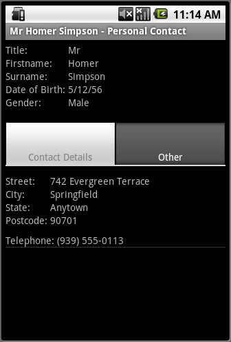
LayoutDecorator to wrap widgets in different sections inside a TabHost, as in Figure 8.1.
This LayoutDecorator recognizes the following parameters, configured using LayoutDecoratorConfig:
| Property | Description |
|---|---|
| layout | Metawidget Layout to use for laying out the inside of the tabs, for example org.metawidget.android.widget.layout.TableLayout. |
LayoutDecorator to decorate widgets from different sections using a TextView. This LayoutDecorator recognizes the following parameters, configured using TextViewLayoutDecoratorConfig:
| Property | Description |
|---|---|
| layout | Metawidget Layout to use for laying out the sections, for example org.metawidget.android.widget.layout.TableLayout. |
| style |
Android style (i.e. @com.myapp:style/section) to apply to section breaks. The
style should be defined within res/values/styles.xml. For example:
<style name="section"> <item name="android:textSize">20sp</item> <item name="android:paddingTop">10px</item> <item name="android:paddingBottom">5px</item> </style> |
